Mobile Application Case Study
Overview
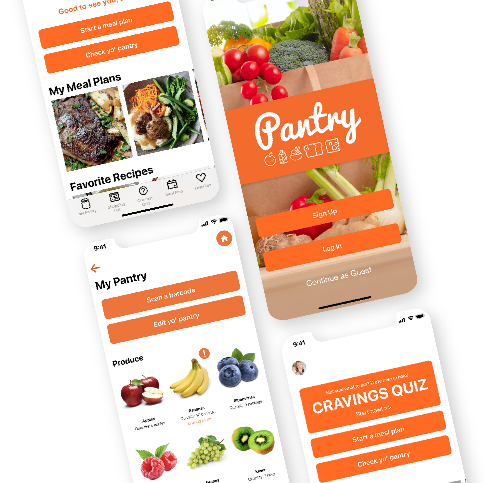
Pantry is a mobile application to help the user answer that dreaded meal time answer; “What should we have for dinner?” The app includes a meal planning function as well as a cravings quiz to help the user find a new recipe to add to your meal plan or restaurant when you’re not in the mood to cook that night.
Roles & Responsibilities
For this study, I was a part of a team of three. My role was the UI designer. I focused a lot on the look and feel of the application. I designed the logo and color scheme. I also helped design the app layout and collaborated with my team for the user research.
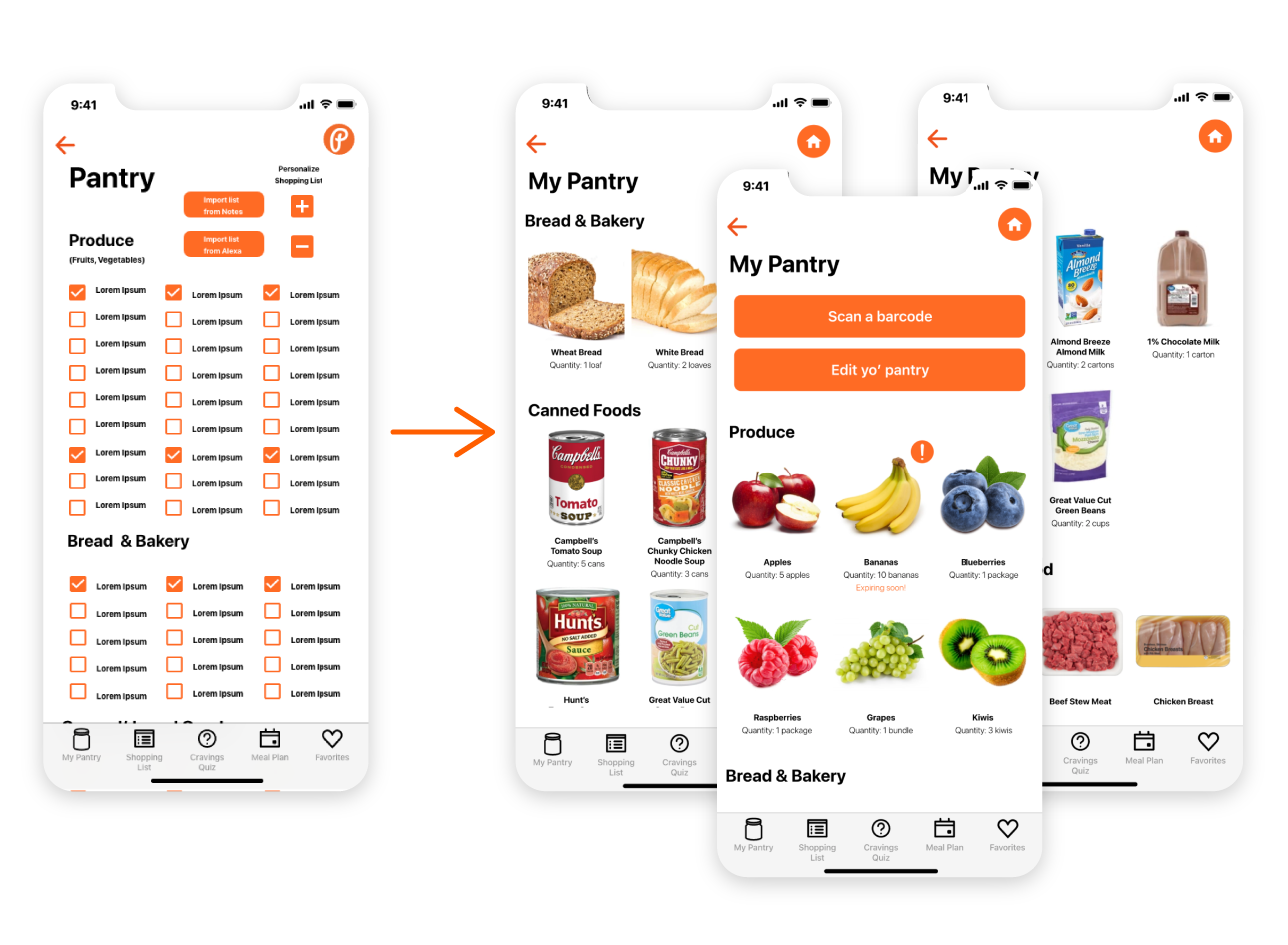
The main parts of the app I had a sole hand in were the onboarding process, the shopping list, and pantry pages functionality.
During this study, we used Adobe XD for the design, Google forms for surveys, and Miro to map out the vision and review research. This case study had a three week timeline.
Problem Statement
A common issue we noticed as a team was that deciding what to make for dinner is sometimes a hard question to answer. Do you stare at your pantry and throw something together? Do you have all the ingredients? Is the chicken thawed out? Do we eat out instead of cooking tonight? In my own experience, so much anxiety can come from planning meals and it’s so easy to cave and grab McDonald’s instead.
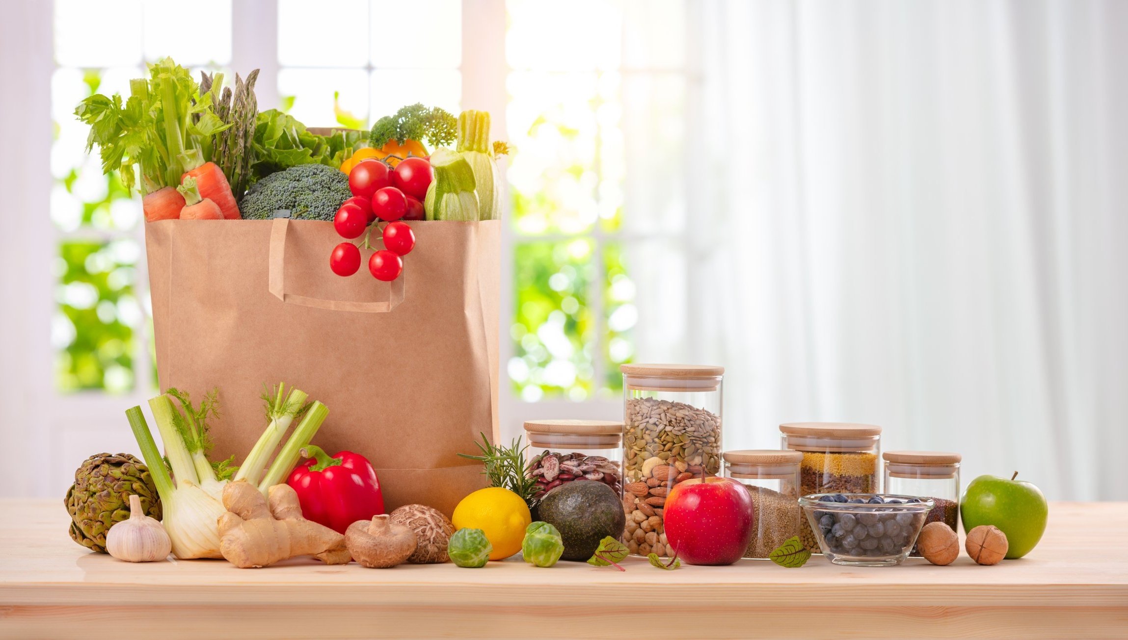
Our application is designed to help prevent indecision and anxiety at meal time. Planning ahead using our app will make the user feel at ease when asked that daily question. Not only that, but you can create shopping lists from recipes, keep a digital pantry so you already know what you have at home.
Users & Audience
To begin our research, we held five interviews and published a survey that received over 40 responses.
Based on the information we gathered, we determined that our user would be a woman in her 30s to 40s. She would be a mom that might also have a job. Some frustrations she could have pertaining to meal time is financial budgeting, never enough time in the day, or meals becoming repetitive.
We crafted a user persona that is displayed to the right.

Competition
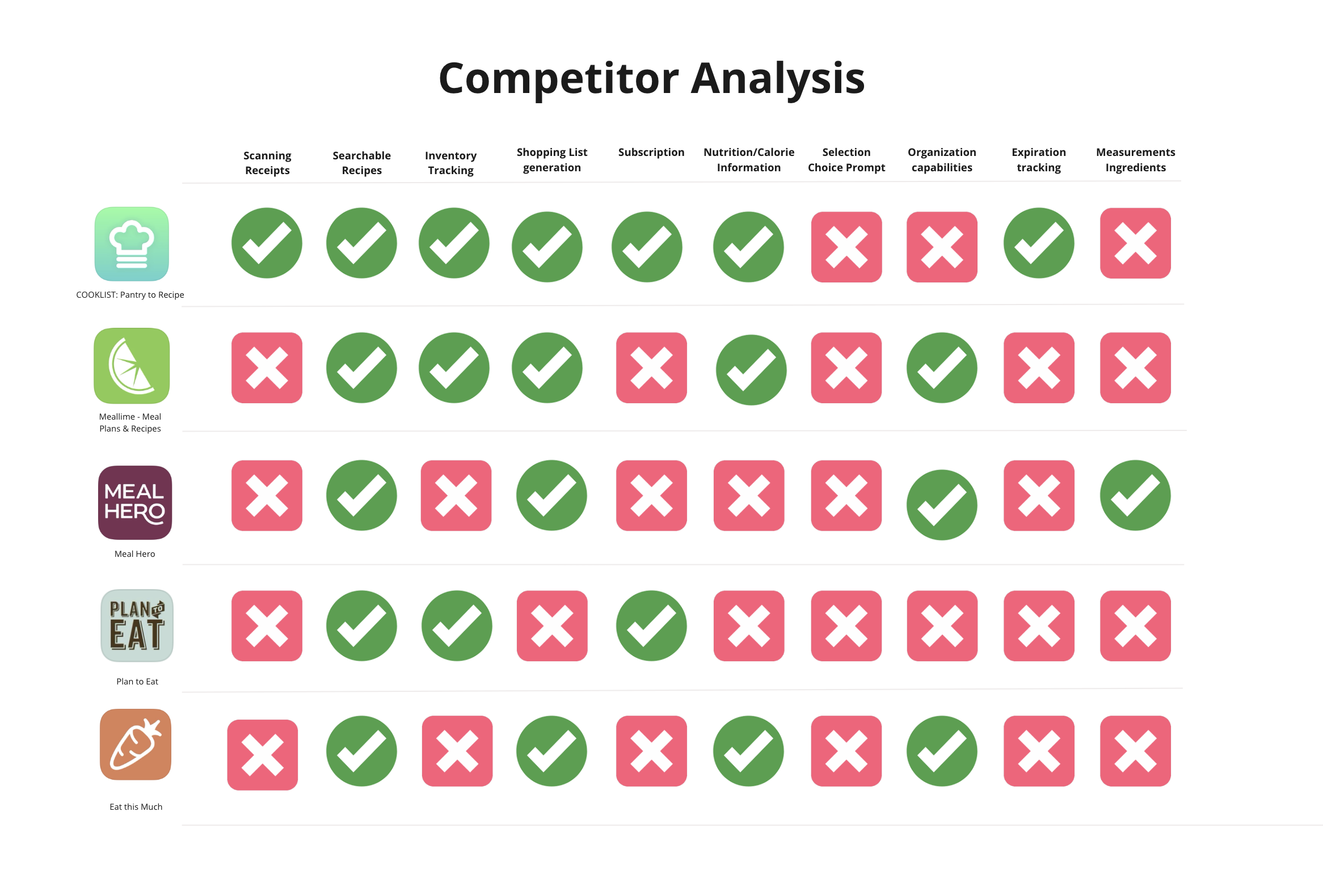
To know how our application would compete with similar applications, we researched and tested other apps that we felt were closely related to what we had in mind for our own app.
To the left, we compared five competing apps including CookList, MealLime, Meal Hero, Plan to Eat, and Eat this Much. The app we felt competed the most with our vision was CookList. They have a lot of similar features that we knew we wanted to include but fell short near the end of the analysis by missing some key pantry features. Other than that, we learned the other competitors lacked a lot of functionality and some did not receive many good reviews from users.
But the most important thing we learned was that this industry is very large and there are many other apps already out there that could be potential competitors. But if there are so many apps being made, is the problem of meal time planning really being solved?
Design Process
-
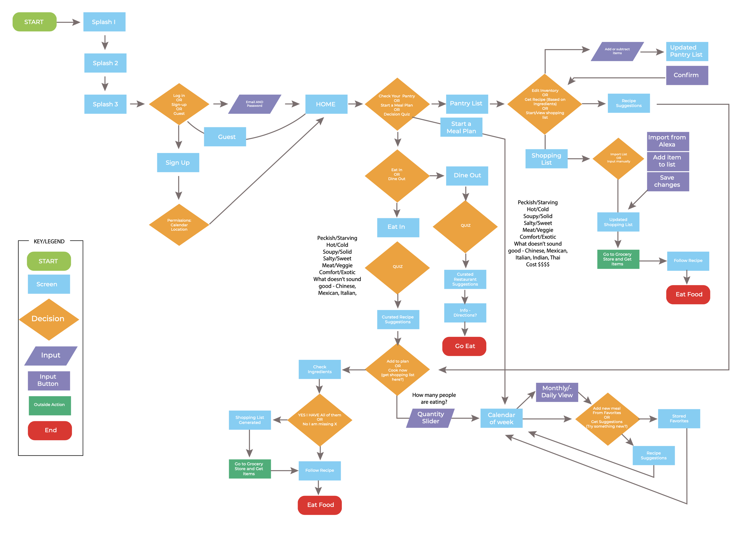
1. User Flow
For our user flow, we tried to be as detailed as possible since this app included a lot more features and functionality than my previous app. We went through each function that was intended from the beginning. Later on we realized we wouldn’t have the time to develop the “Alexa” function. So instead focused more on the Cravings Quiz and Meal Planning functions, which we felt held high priority.
-

2. Wireframes
From the user flow, we started to develop the wireframes. We did these digitally since we could only meet as a group online through group Zoom meetings. We still included some color to better define different elements and components but for the most part, everything was straightforward. We wanted to focus more on the flow of the app over design. All in all, having the wireframes created digitally made the next step much easier to complete.
-

3. Low-Fidelity Prototype
Now that we have wireframes, we moved forward with the low-fidelity prototype. As a whole, we each divided and conquered since this app was massive. I was in charge of the Homepage, the Profile page, the onboarding process, and the overall look and feel. I also created the logo and color scheme for entire app.
-

4. User Testing
For user testing, we each interviewed a couple people each. By using this simple layout, we tested a couple different functions that we were the most concerned about. We did a few tests on the Cravings Quiz because we wanted to know if it was easy to use, if the user understood the process, and if they were successful in the end. The tests were super insightful and helped us improve our app tremendously.
-

5. High-fidelity Prototype
To finalize our application, we went through and added tons of content, including meal images and a couple recipes. In the end, I was very happy with the end result and I definitely think this was my proudest app to date.
-
6. Post-collaboration Updates
After the collaboration had ended, I went back and made a couple of updates. When we did design, each of us in the group took pieces of the app and designed them individually. I decided to re-work some pieces so that they fit the rest of the app’s look and feel. A piece I redesigned was the Pantry section. Instead of the list of words, I decided to add pictures to make it visually appealing and easier to navigate.
Final Prototype
The final prototype can be viewed by clicking the button below. Feel free to leave any comments!
Final Notes
In the end, this was a very good experience for me. It was my first time collaborating with a team and it definitely won’t be my last. I really enjoyed working with others and seeing other point of views instead of relying on my own judgement. It was a very positive experience and I believe we created a beautiful app that I could see being used in real life.