
Mobile Application Case Study
Overview
For those who don’t know what overlanding is, it is a form of exploration by taking trails and roads that are the least traveled on. These roads may be around mountains or down a dirt road. But they always end up miles from civilization. Most of the time, these trips can be from a few days to a few weeks. So an avid overlander builds their vehicle with everything they need to survive off the grid. But being so out in the wild, trip planning must happen before leaving home.
OVRLND is a mobile application dedicated to helping the outdoor enthusiast plan their future overlanding trips. This app includes features such as road maps, trail information, discover trails near you, and a built in community group.
Roles & Responsibilities
This application was researched, tested, designed, and conceptualized by myself. This was a solo project that was also peer reviewed.
During this study, I used Adobe XD for the design, Google forms for surveys, and Miro to create my vision. This case study had a three week timeline.
Problem Statement
Overlanding can take hours of planning and research for a single trip. Users look for all the information they can prior to hitting the trails to make sure they are safe. They look for trail hot spots where there could be danger or a potential overnight camp spot. Maybe even recommended stop points to see a rare view or a historical area. These are all things that will ensure the user is thoroughly prepped for their next adventure.
The problem with most current applications is that they don’t offer planning tools or checklists when preparing for their next adventure. So when the user sets out to plan their next trip, they have to read long blog posts, search google for help, or browse other applications that don’t offer much help. I firmly believe there needs to be a central location with everything an overlander would need to cut down on planning time and more time on the trails.
Users & Audience
To begin my research, I created a User Research Plan to map out what I wanted to discover along with 3 objectives that could help me find data to back-up my research question. With those objectives, I listed some questions that would help me dive deeper into the world of over landing and learn what are the needs and desires of my user base.
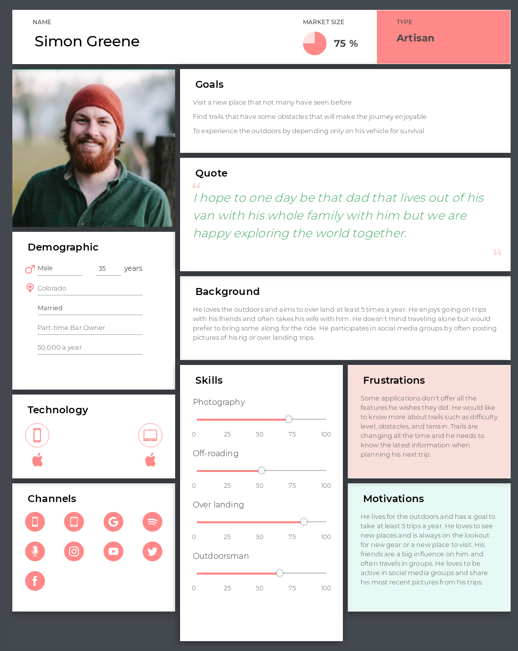
For my interviews, I interviewed 5 people. Some I met at a local over landing store in Salt Lake City called Hinkley Overlanding. The others I met through social media communities I joined. I included my transcripts with my interview plan so I could see the all the results side-by-side with the questions I asked and used the set up questions as my interview script. Some trends I noticed is that it is highly likely for them to post on social media about their trips. Most don’t like to rely fully on an app when planning their trips but it can be helpful. But planning a trip has shown to be helpful and beneficial in different ways.
In addition to my interviews, I also published a survey and had it posted on 3 different Facebook groups. In the end, I received 24 responses in the matter of 4 days. Some things I learned from the survey are: People are more likely to share their excursions over social media than not, some do use apps to plan their trips but they don’t like to fully rely on them, and a lot of people seem unsure how they would use an app to plan a future overlanding trip There is a split between people who definitely use an app to plan their trip vs. those who would not use an app and prefer to plan it themselves.
To the right, I crafted a user persona of who I believe would use an application like OVRLND.
Competition
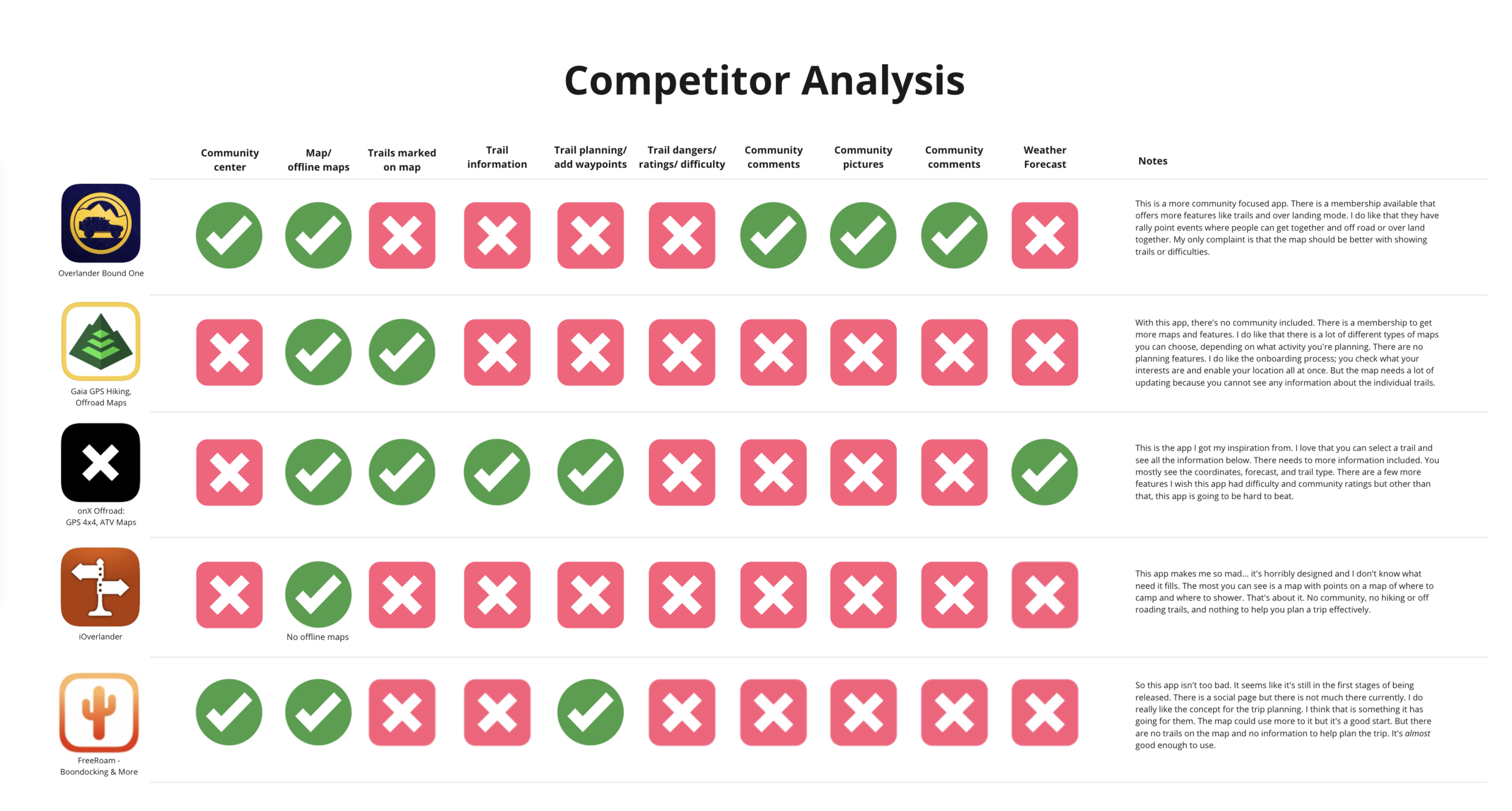
To know how my application would stand up against the competition, I had to do a thorough analysis of my competitors. A few other apps I found are OnX Offroad, Overland Bound One, Gaia GPS, iOverlander, and FreeRoam. While all of these apps had some good features, a few of them did not have a lot of the features that I hoped they would.
To the left, I made a simple analysis of the features I found in my research that would be beneficial and either put a green check mark or a red X mark. I was very surprised by how much red I had found and was disappointed that there are not more apps with available features.
Design Process
-

1. User Flow
I worked very hard on this user flow. I imagined I was the user and what would I see and experience when I opened the app. I knew there would be a sign up process prior to getting to the home page. From there, each tab on the lower menu bar has a list of features that would be included on that screen.
-

2. Wireframe Sketches
Now that I have a solid user flow, I proceeded to make sketches of the screens I wanted to design for the app. It was super helpful having that structure already built and you can see I start to connect screens by defining where a link would take you.
-
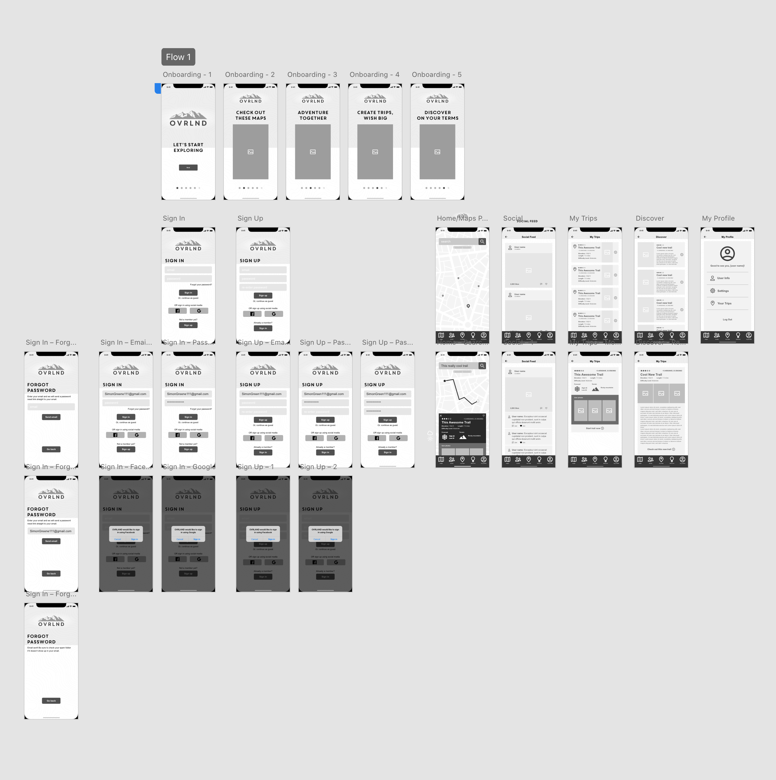
3. Digital Wireframes
This is the part of the study I was most excited for. Keeping my sketches in mind, I proceeded to design in greyscale. You can see the logo and the beginning of the content layouts in the right cluster of screens. Later on, I do alter these slightly but all-in-all, having these designed digitally was a great feat in itself and the app was starting to take great shape.
-

4. Low-Fidelity Prototype
After designing the screens, I proceeded in Adobe XD to start linking everything together. This was a lot of personal testing as well to make sure all of my links were working and that the flow made sense. I referred back to my user flow a lot and double-checked everything so I could be well prepared for the next step which will be user testing.
-

5. User Testing
For my user test, I made a list of features I wanted tested, including the onboarding process and the ease of use. I gained some great insight to help with the flow of my app. I noticed a couple hiccups with my links that were easy fixes. But my end goal was to make this as easy as possible to help my users sign in/sign up easily and navigate the app without any issues and I these user tests were a great help.
-
6. High-fidelity Prototype
To finalize my prototype, I proceeded to add color and real images to bring life to the entire app. I decided to go with a blue tone with orange accents to help the app feel bright and friendly. I was very happy with the end result.
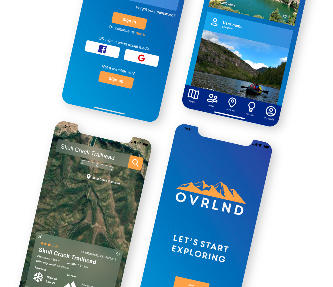
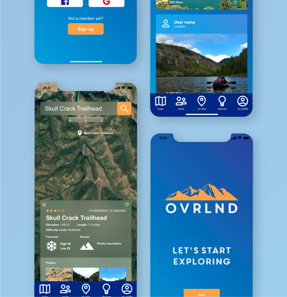
Final Prototype
Since the final prototype was made, I did go back and update a couple of things such as smoothing out the onboarding process and the sign in button works as it should now.
Leave a comment if you hit a snag, I promise it will not hurt my feelings!
Final Notes
This was a very insightful experience for me. I learned that you cannot design without keeping the user in mind and it’s very important that you understand what your user’s wants and needs are because sometimes what you believe the design should be may not be the end result. So it is okay to put the user first and put your personal opinions to the side for the moment.
Looking forward, there are a few more features I would like to implement that are not high priority but could be helpful to the user. I’d love to learn more of what XD has to offer and how I can improve the functionality of my app. But overall, this case study was so much fun and this has really opened my mind to all the possibilities this process has to offer, not only in my current position but the future as well.