
Website Case Study
Overview
Kidztown is a local non-profit organization that needed help updating their website for this day and age. Currently, the website has been extremely underutilized and very bare minimum. My team believes we can help this organization by developing the functionality of the website for better usage by both the user and the owner.
Kidztown is a head-start program that helps children prepare for future schooling. This government-funded program is based in Salt Lake City with multiple locations throughout Utah.
In this case study, we do a complete redesign of their website and increase the usability of their website. We believe the website is not used to its fill potential and could include many more features that would benefit the parents of children attending the program.
Roles & Responsibilities
For this study, I was on a team of three. My role was UI Designer and research collaborator. I designed the bulk of the website and helped with the initial research prior to design. During this study, we used Adobe XD for design, Google forms for surveys, and Miro for seamless collaboration.
Problem Statement
At first glance the current KidzTown website feels a bit dated and it is not completely clear on the level of services offered. As a team, we found the navigation to be simple but only provided information on their four locations.
We felt that the client could use an update to their site, but also has a great opportunity to better inform their users on their services and could add content that would offer various connections to better engage with their users.
Users & Audience
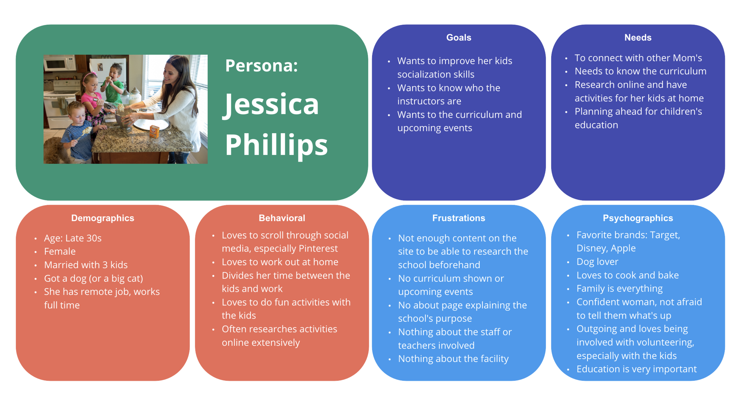
To begin our research, we held five interviews and published a survey that received over 40 responses.
Based on the information we gathered, we determined that our user would be a woman in her 30s to 40s. She would be a mom that might also have a job. Some frustrations she could have pertaining to meal time is financial budgeting, never enough time in the day, or meals becoming repetitive.
We crafted a user persona that is displayed to the right.
Competition
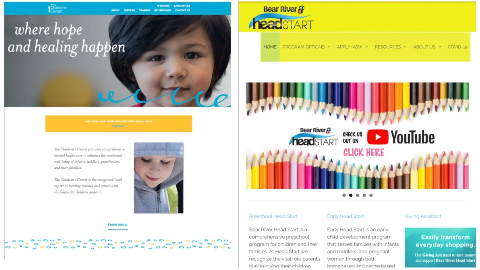
For some comparable competitors, we found a couple of other websites that also run a head start program. Two of them were other local area head start programs and the third was a more widely-known website that is focused on children’s learning.
Some strengths that our competitors have are the clean and modern look with ease of functionality is important. These sites also offer lots of external resources their user would be interested in so the information is readily available. And lastly these sites are well-organized so the user doesn’t have to dig through the site to find what they’re looking for.
Our competitors were not perfect and still could offer a lot more functionality that we found lacking on their sites. We hope to be able to offer more to the user in our own website design.
Design Process
-
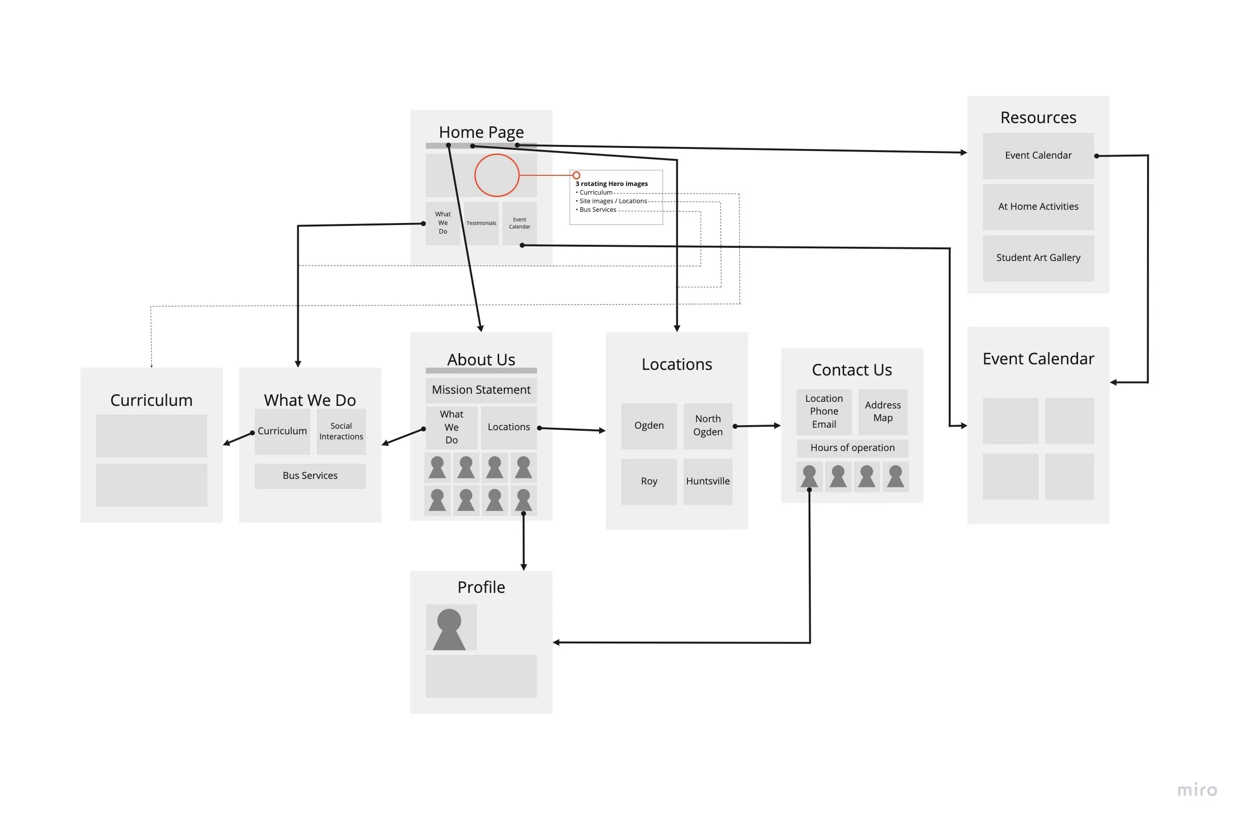
1. User Flow
For our user flow, we start off at the home page and followed the path that we believe she would take while researching on the site.
Some of the more important pages such as “about us” and “locations” are likely to be high traffic areas. So we added information the user would be searching for in those areas and used big headlines so they are easily found.
-

2. Wireframes
For the wireframes, we kept the layout simple and clean. We wanted to make sure we used the space to our benefit while also making the navigation simple and the information easy to follow.
-

3. Low-Fidelity Prototype
After the wireframe sketches, we created a low-fidelity prototype that was very basic. We quickly realized the entire site was spread out way too much and I made sure to keep better margins in the high-fidelity. But we did move forward with this design to develop further for the high fidelity.
-

4. User Testing
For our tests, we had some great feedback from our four tests to help fix some broken links and some new content that our user would be looking for such as a list of staff members and teachers page.
We also realized that our homepage hero element was confusing some and ultimately overlooked. We did not realize it was a problem until the testing and decided as a group that it needed some re-working.
-
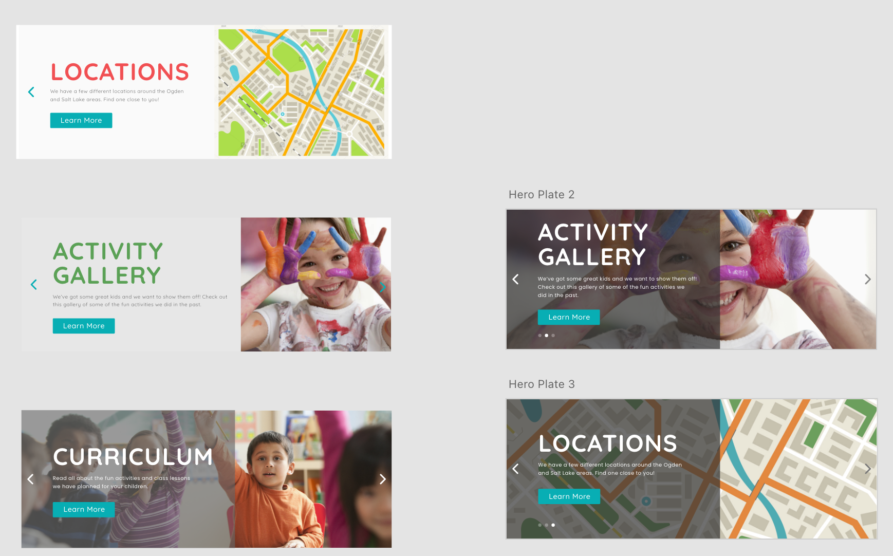
5. Iterations
After our testing concluded, we moved forward to redesign the homepage hero. As you can see from the image above, we tried a few different iterations before settling on the dark overlay.
We then did a few more user tests to make sure our intuition was correct and that the new design proved effective. In the end, the new hero proved worth it and became the first thing to be interacted with. Especially with the rotating effect, our users enjoyed clicking the arrows to cycle through the heroes.
-

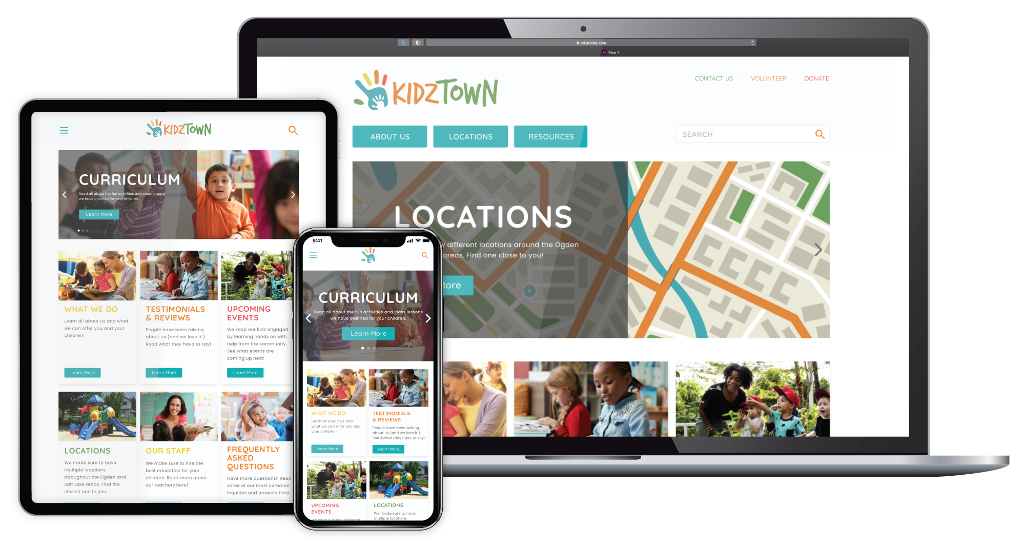
6. High-fidelity Prototype
After testing and iterations was completed, we finalized our prototype. To add a little more of a fun element, we played around with some color splashes. In the end, we were very happy with the outcome and did reach out to the company to share our design.
Final Prototype
The final prototype can be viewed by clicking the button below. Feel free to leave any comments!
Final Notes
As a team, I believe we created a successful case study that was a giant step up from the original design of the KidzTown homepage. The experience itself was eye-opening, especially when it came to the user testing. User testing is an area I, personally, would love to work on and this case study was able to help me become braver and more open-minded when it comes to feedback.
One lesson I learned is that feedback is not meant as a personal attack, it is to help the website become better or help me see flaws unaware to me. And that is ok! Flaws are problems to be solved, which is what my job as a designer is.