
Website Redesign Case Study

Overview
The Federal Trade Commission has asked me, personally, to create a new website. They pushed their big red button and I saw the silhouette light of a cat shining in the sky! No need to fear, Super Katy is here! (Cue blowing wind and red cape).
Well, sort of. This case study was meant to test my skills as a designer from start to finish. Just like past case studies, we went through the normal process until it was time to design. It was required to create a full style guide that we would then use for the final prototype as well as a responsive view.
Roles & Responsibilities
I originally did start with a partner but we were unable to collaborate due to unforeseen circumstances. So for the duration of the project, I created almost everything. She did help in the beginning with set up and discovering the user until she was unable to continue. Which is okay! Things happen so I pushed forward for the sake of the group.
My role was designer, user tester, and everything in between. The programs I used were Miro, Adobe XD and InVision. Other requirements were to create a new website for the government website that was also responsive, so you will notice I have included both mobile and desktop versions.
It is also important to note that I was only required to re-design the homepage, since there are hundreds of secondary pages that I would take much more time to complete in the time I was given. Also, the site has been updated since the time this case study was completed so I will be showing screenshots from a previous iteration of their website.
Problem Statement
The FTC is a long-standing government entity that has multiple functions needed on their website. The user needs to be able to come to the site and get to where they need to go in as little time as possible. The current website shows signs of being out-dated and inconsistencies in design.
I am here to ease those pain points so the site is usable, fresh, and easy to use.
Users & Audience
Our users visit this site because they want to keep up with the state of the economy as well as learn how to protect themselves against scam calls and identity theft. The FTC helps keep the consumer market competitive and fair.
Our user would use the homepage the most. There are quick links that can get her to where she needs to go fast. She would most likely use the report identity theft and register for the do not call phone list. And for those users who prefer a more indepth experience, there are many links that lead to blog posts, press releases, and a calendar for events and latest news.
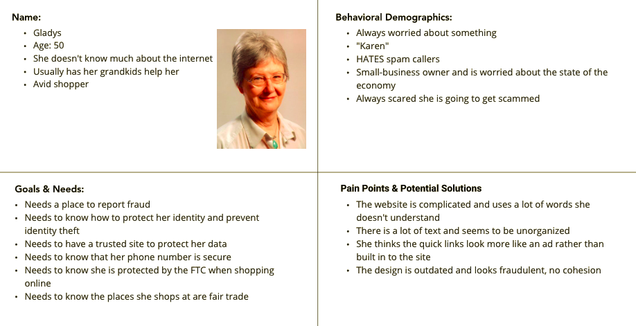
From what we currently know about our user, we created Gladys. She is a 50 year old woman who is not the best with the internet but is someone who needs a place to report fraud when she becomes a victim. At her age, it happens often and she would like a place she can fight back.
Heuristic Evaluation
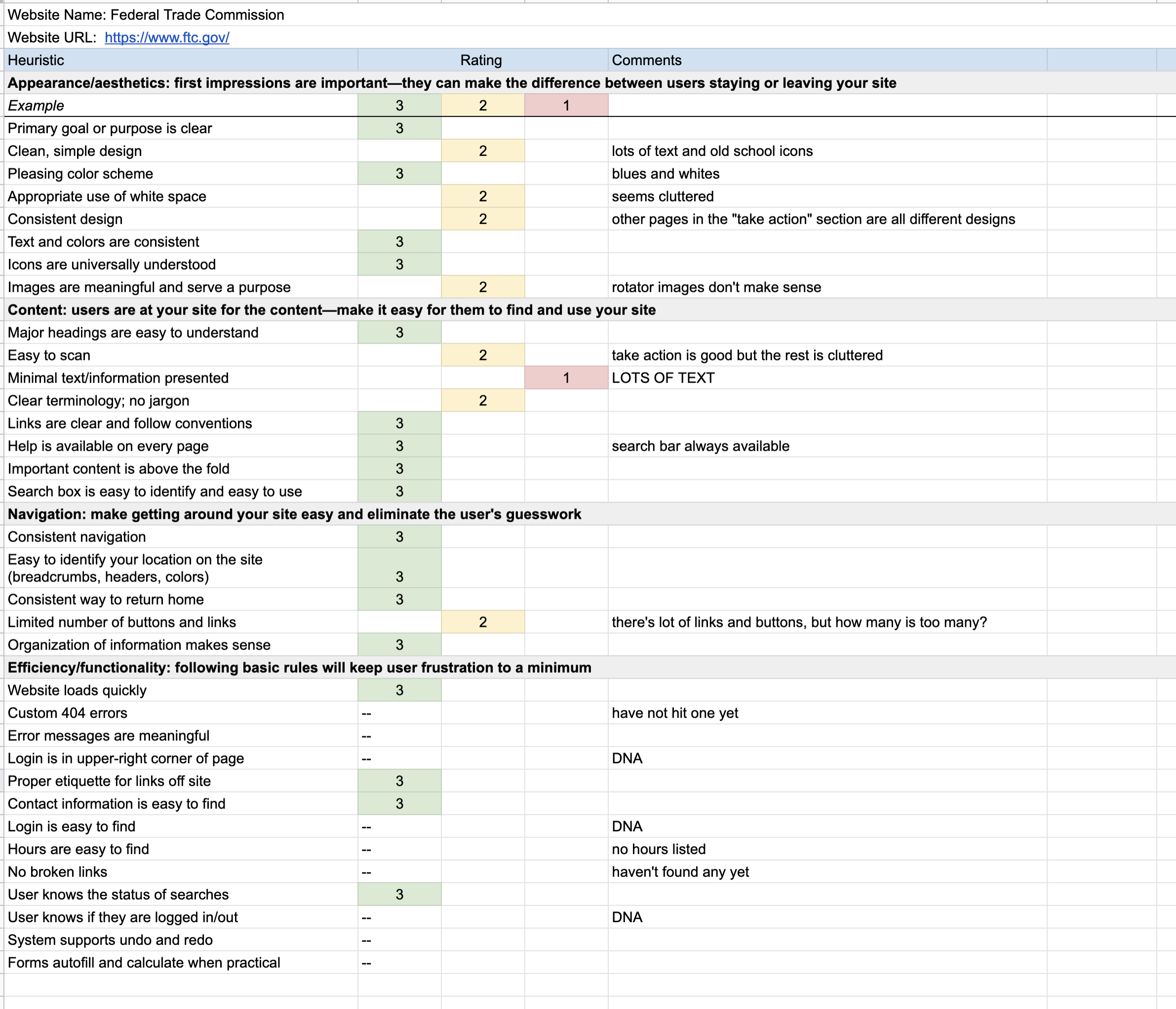
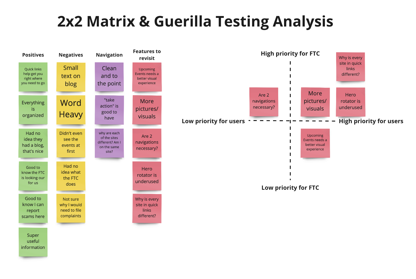
Since this is a site that is already live and in current use, we needed to complete a heuristic evaluation to find out what we can do to make it better and easier to use.
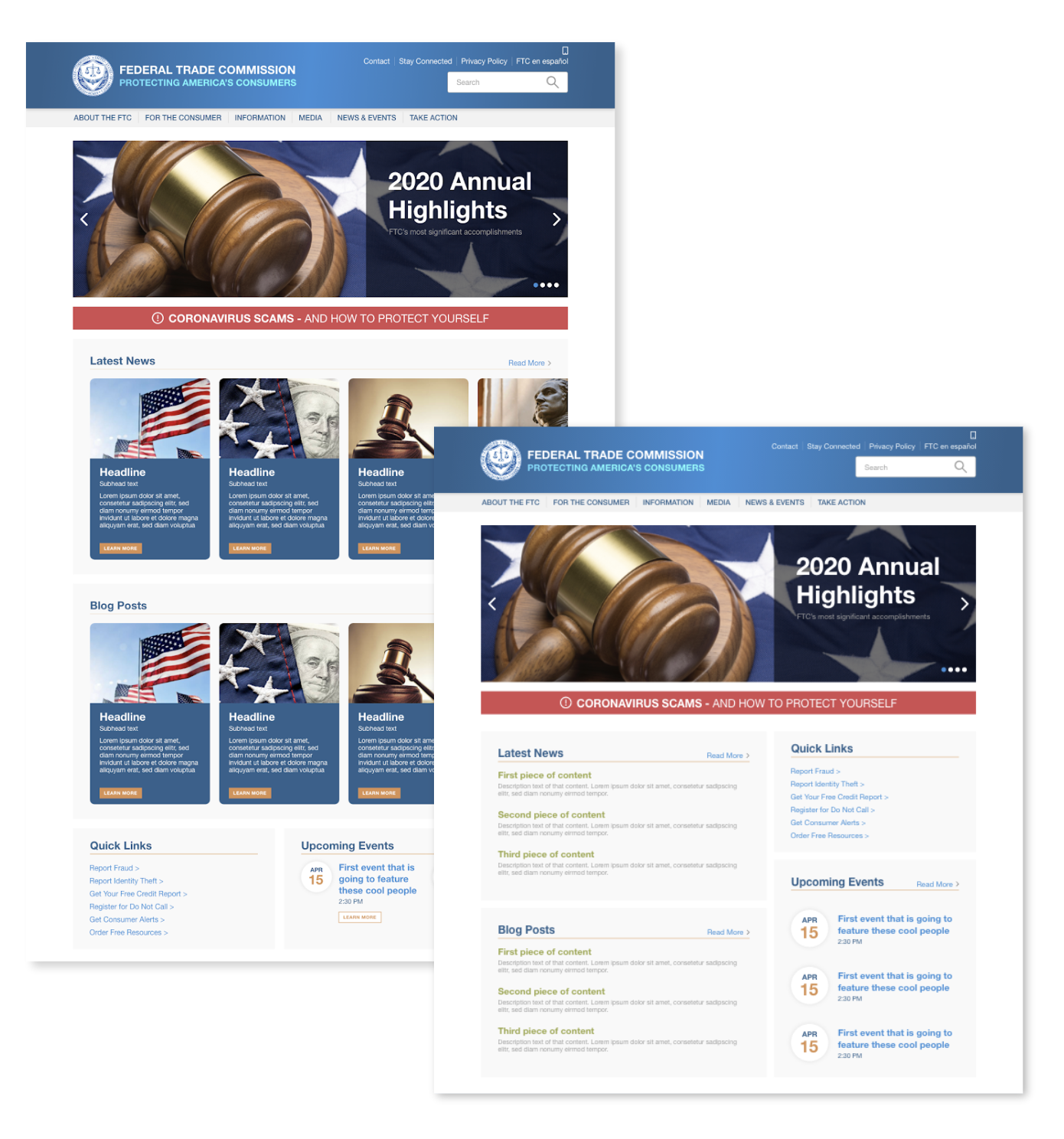
As you can see from this image, we felt that the text was highly dominate on this site, which is not always a good thing. Having so much text makes the site feel cluttered and uncomfortable. The user can easily get lost because their goal is to find what they need as quickly as possible.
With this site being super text heavy, we felt that the actionable items get lost and the user spends more time reading than completing what they came to the site to do.
Accessibility Test
As part of the case study, we were required to complete an accessibility test on the colors and font choice of the website. After gathering the most notable colors and constant fonts, this site passed with flying colors.
This was a great way to see how important accessibility is. Not many realize how much science goes in to creating a website so that it is usable for every type of person.

Design Process
-
1. User Flow
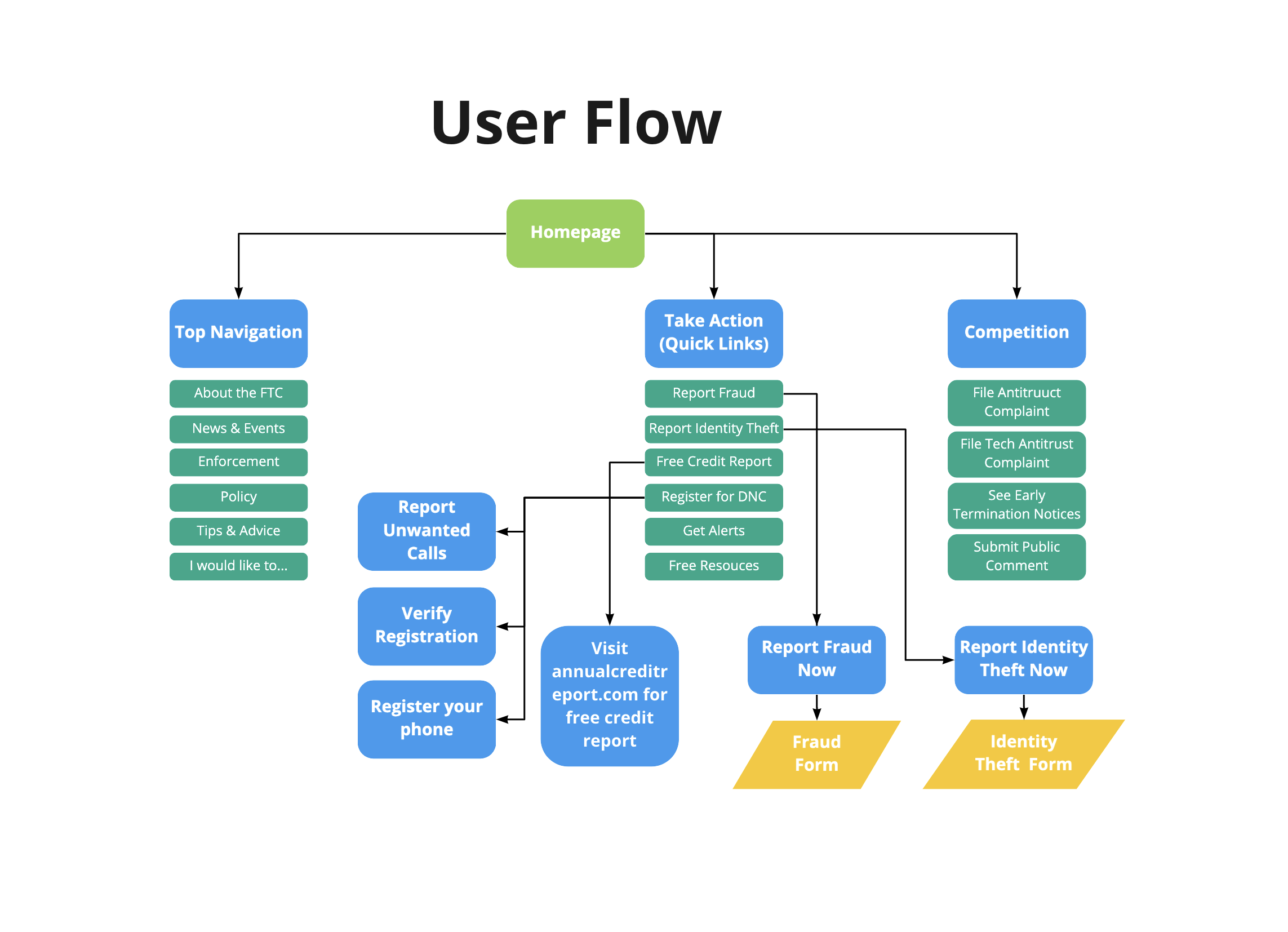
After completing some prior evaluations, I noticed that a lot of the information is at the forefront of the site. So by taking a look at the user flow, it helped us to everything the site has to offer. The user flow is fairly simple. A lot of the links lead to landing pages that then instruct you to leave the site. Typically, our users are looking to report fraud, report identity theft, and register for the do not call list which is why we focused our flow on those top 3 in the “take action” section.
-
2. User Tests (Prior to redesign)
For the user tests, we had them perform a couple simple tasks. We asked them to imagine they were someone who needed to report fraud or identity theft and see their process. We tried to focus on items that we knew there might be an issue with to see how the user would handle that situation. From what we observed, the user spent way more time reading the content than they did completing any actions.
-
3. Usability & Heuristic Issues
Some of the pain points we have encountered are inconsistencies with design and no links to return to the parent site from the quick links. Since our objective was to focus on the homepage, we were not able to fix the second issue, but at least we have the power to focus on design and organization of content.
-

4. Wireframes
Moving forward, I went ahead and started designing the layout of the site. I realize I went above the requirements of a wireframe and included some coloring, which is not needed. But does help envision how the navigation and hero help the structure of the site. After the hero, the content is given its own designated space outlined in grey. This helps the site feel more intentional and easier to skim.
-
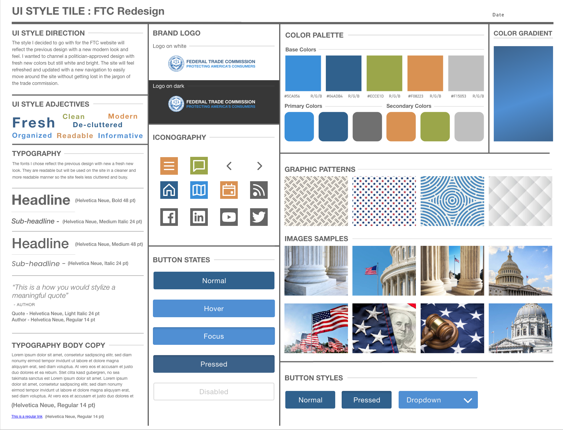
5. Style Tile/Guide
Now that I have a solid plan for the site, I needed to determine the style guide in case this was ever passed forward to developers. By creating a style guide, this helps create consistency within the site. The direction I intended for the website was to freshen up the UI with all new colors and imagery. This helps the site feel welcoming to the user.
-
6. User Testing
For my user test, I did a live test where we went through the navigation and body of the site. My main focus was usability and clarity. I noticed that there were still some issues with the body of the website so I made a note to return to the drawing board on the design. I felt like there were some stumbles in the organization and felt like there was a better way to present the information. Overall, the testing was insightful and I knew right away what my next step would be.
-
7. Iterations
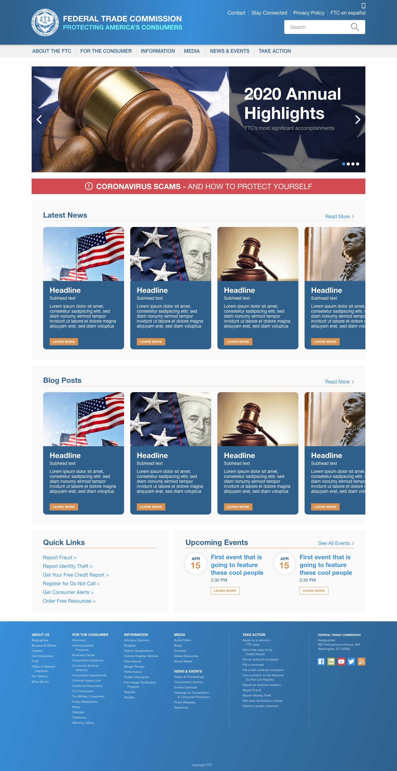
So I returned to design for the body of the website. In the end, I designed these cards that better presented the information of “latest news” and “blog posts” in a more visual way. I felt like I needed to lean more towards an image focused card system so the user can interact with the scrolling effect. I also moved the “quick links” and “calendar” to below the two carousels so the user has to scroll past two attention grabbers first. Similar to how grocery stores put milk at the very back of the store instead of right when you walk in the door. I want the user to browse a little before continuing with their tasks.
-
8. High-fidelity Prototype
Since I already had included colors and imagery in my prototype, I mostly focused on little tweaks here and there. I added the carousel effect with the cards and let the OCD run wild. I really wanted this to be a website that was enjoyable yet informative and I feel like I was able to achieve that. Also, I required to include a mobile version as well so I can showcase how the site looks in different circumstances.
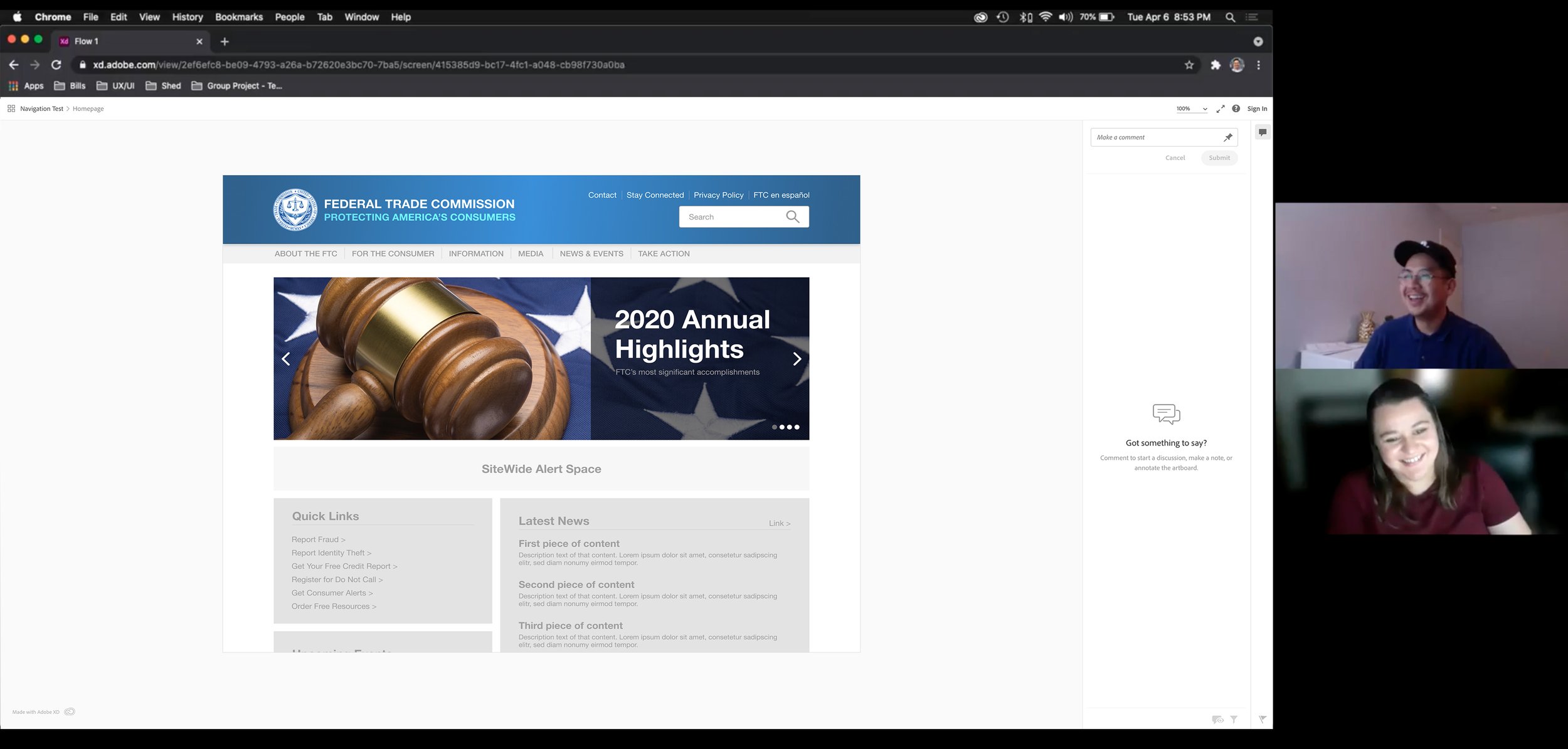
Final Prototype
The final prototype can be viewed by clicking the button below. A small note, there is a button in the top right corner that allows you to switch between the mobile and desktop views without having to resize your browser. Feel free to leave any comments!
Final Notes
This case study was, in it’s own way, a bit challenging for me. Not only did I struggle with my partner but I had to evaluate a website and redesign it to make it better. For a site as high-profile as the FTC, you would expect the site to be well-maintained on their end. So how would you make it better?
I believe I did end up with a good solution to a couple of the problems I noticed and I’m very happy with the outcome. I will admit, the design kind of got out of hand and I did more than needed on some of the preliminary design work but I’m happy with where I ended up and I learned a lot about my capabilities. Not only did I design something that was professional and fresh but concise and clear. Which was exactly my goal from the beginning.